Project Description
The intention of this project was to select an existing package design that could benefit from a redesign. Research of the existing package design and its chief purpose was conducted to create a new design, to improve its use by the primary target audience. I chose to redesign an existing strawberry package.
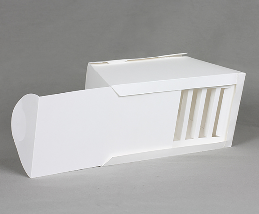
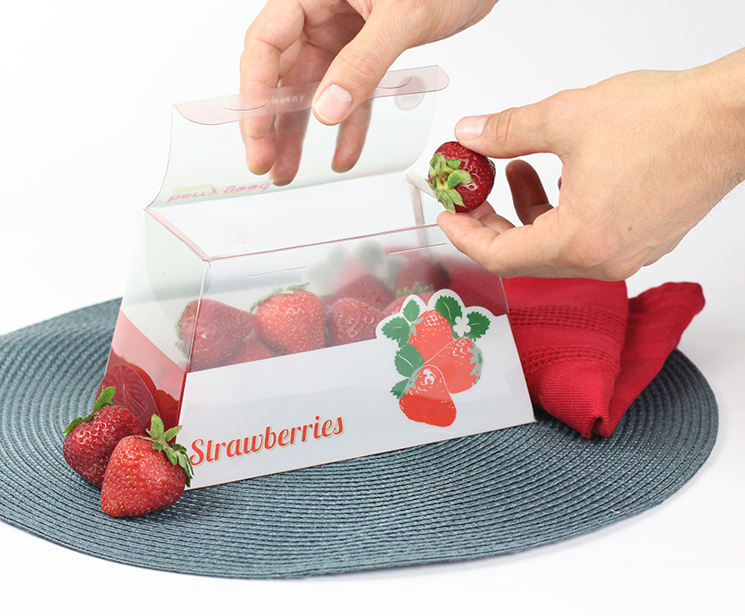
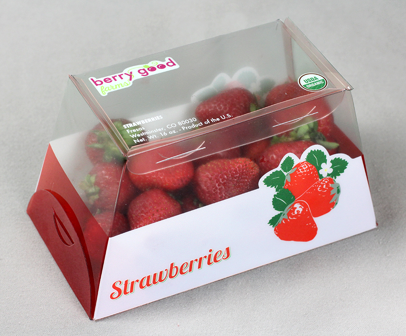
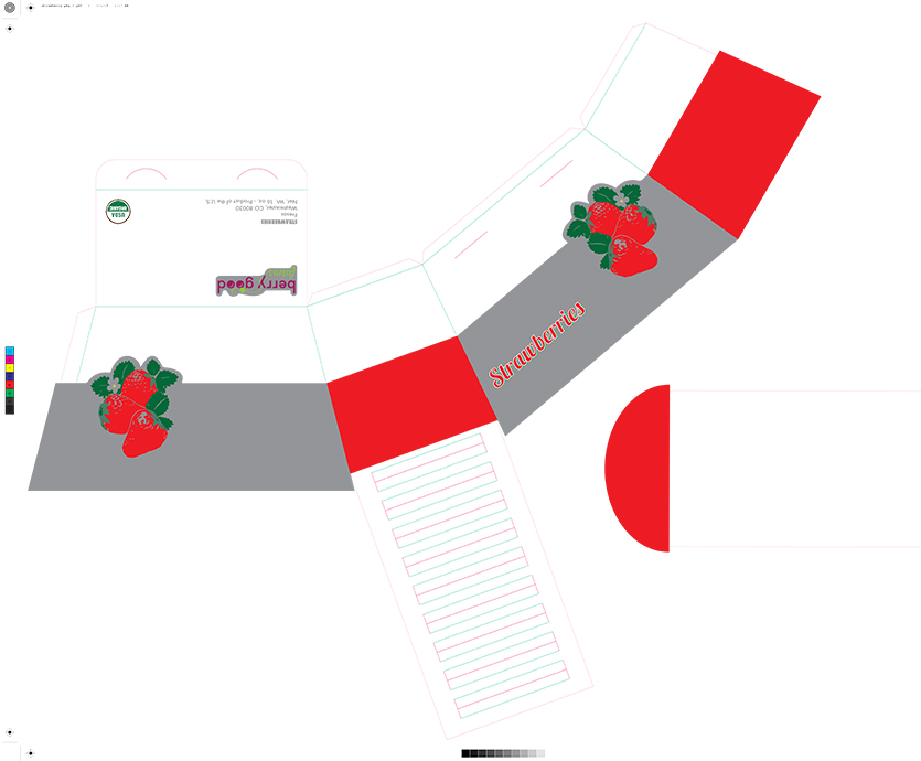
My redesign of the berry container/box is primarily a planar design, with very clean and simple lines. There are no curvilinear planes or extrusions. The planes are angular in nature, allowing for drainage. Also, there is no wasted space in the volume of the box.
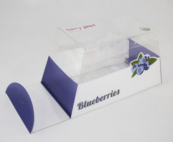
I also added the aesthetic appeal of attractive graphics that indicate and enhance the type of berries in the container. I also created a logo for the berry growing company, which I chose to call Berry Good Farms.
After crafting a Bristol board prototype, I worked with a Denver printer to construct the final package. I created a two-piece, single sheet, flat design with die cuts and scoring indicated, to be printed on thin, clear acrylic. Then, assembled the pieces. This package could be crafted mechanically.
