Project Description
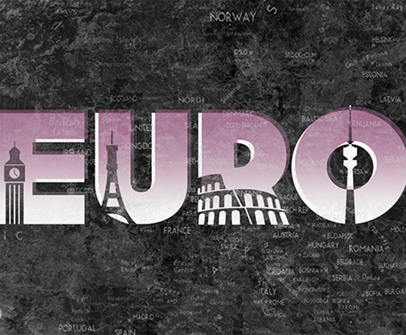
On a recent trip through Europe I was surprised to find very little well-designed marketing collateral. I thought that Europe could really use a new logo, and a great advertising campaign. Not that people really need to be enticed into going to Europe…it sells itself. Nonetheless, I decided to take this on just for fun!
I designed a clean, simple typographic logo for which I created very basic icons to portray easily-recognized sights. Then, I decided to play with some interesting backgrounds, including a map of Europe and grunge textures. It gives this simple logo a kind of retro, screen-print-ish look. With a pointed tagline, I think it looks kind of neat on a billboard.
There’s more coming for this self-commissioned project. Check back soon!


